Editor: Whether you’re a copywriter, author, freelancer or blogger, knowing how to craft a call to action (CTA) is essential. Being such a tiny part of a web page, a call to action can be easily ignored. Yet, it’s an incredibly important part of the page; the “door” that visitors step through, whether to buy, sign up or learn more about something. This makes call to action copy no trivial matter.
Do you enjoy board games?
If you answered “yes”, then you’ve probably played Trivial Pursuit. For those of you who haven’t had the pleasure, here’s how this classic game works…
- You move your “pie dish” around the circular game board
- Depending on the color of the square your dish lands, you answer interesting and often obscure questions around geography (blue), sports & leisure (orange), science & nature (green) and so on.
- On certain larger squares, answering the right question gives you a colored slice of “pie” for your dish – get all the different colors first and you win!
It’s a lot of fun, and I’ve had the pleasure of playing many times. But like most board games, Trivial Pursuit is… trivial. Other than providing some light entertainment, the game doesn’t really matter in the grander scheme of the things.
Unfortunately, that’s an attitude copywriters can take when it comes to writing call to action copy.
Why Calls to Action Are No Trivial Matter
The handful of words that sit inside a button or link are often seen as mere afterthought: something you do when everything else on the page is done.
But those handful of words hold incredible power in persuading people to click.
Copywriters usually oversee all the words on a page, but when your attention is on editing seductive sales copy or perfecting a jaw-dropping headline (both of which are important), buttons and links can easily get missed.
The end result? You get unappealing, click-repelling calls to action like this:

As a copywriter who’s paid to get “conversions” — conversions that are usually the result of a click — overlooking the call to action can hurt.
It makes sense that for any writer ultimately judged by the results they deliver, the call to action should be high on their list of priorities
The Core of a Cracking CTA
Make no mistake, great copy is only one part of a great page.
The same goes for the words in a click-worthy call to action.
But writing the handful of copy that makes up the call to action can get lost in discussion around the other conversion-boosting elements.
For example, conversion experts will also examine:
- The color of the button or link
- Visual aids (like arrows) to highlight the button
- Putting your calls to action in the right spots on the page
- The copy AROUND your CTA
- Testing endless variations of your CTA
Nail these factors and you’ll turn a good CTA into a great one. But at the core of a call of action is… well, the call to action. The WORDS that nudge, scream or prompt a visitor into making that click.
An incredible example of the power of words can be found with Veeam, a company specializing in backup software. A small change to one of their calls to action — from “Request a quote” to “Request pricing — got a 161% increase in the number of clicks.
So, how do we write an equally irresistible call to action?
Let’s look at…
5 Ways to Craft a Click-Worthy Call To Action
Although there’s a lot you can do with a call to action (see the bullets above), these tips are focused purely on the copy itself. If you want to dig deeper into the other aspects, Conversion XL has an excellent post that covers every angle, from page presentation to heat mapping.
1. Put Readers in the Middle of the (Call to) Action
It’s “web writing 101” that every word on your page should be written with your reader in mind.
That goes double for your call to action.
When you write your button or link copy, frame it in a way that directly puts the reader into that CTA.
This has been proven to be a powerfully persuasive element. To veer briefly into the conversion world, Michael Aagard at Unbounce conducted several A/B tests that compared “you” vs “me” call to action copy.
- In one test, buttons with “Create My Account”, as opposed to “Create Your Account” saw a 24.95% higher conversion rate.
- In another test, “Start your free 30-day trial” vs “Start my free 30-day trial” copy found a 90% increase in click through rate for the “my” version.
John Loomer, a marketer known for his FB advertising prowess, nails the “me” copy on his webinar page.

2. Convey the Consequences of the Click
Your readers won’t click on buttons or links unless there’s a reason for them to do so. On the other hand, that’s exactly what you need them to do — whether it’s a link to another page or a button to sign up for something.
So, spell it out for readers with command-driven copy that makes it easy for them to understand the consequences of them clicking.
Jo Wiebe provides a handy template to nudge copywriters into an imperative style that still focuses on readers:
“I want to ____________”
(with _________ being your call to action copy)
It can be as simple as “I want to join the club”, or a more exotic “I want to train giant seahorses to be underwater couriers”.
Either way, the formula’s there to help you remember: start with an action verb that spells out what the reader wants to do.
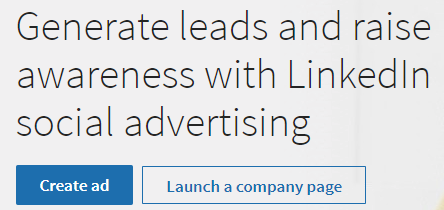
The page for LinkedIn Ads does just that with its two calls to action in the hero section.
3. Harness The Power of “Start”
Not all your visitors are unfamiliar with what you’re offering. Some of them will want to get stuck into things immediately.
In other words, they’ll want to “get started”.
That’s a popular phrase adorning a lot of buttons around the web, and there are good reasons for it.
“Starting” is simple, short and to-the-point. If visitors know what you have, starting makes perfect sense to them. Starting’s also perceived as a positive action, and phrases like “get started” or “start now” encourage visitors to make that positive move.
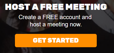
For example, Join.Me is simple, uncomplicated meeting software. What else do you need to do but “Get Started”?
4. Be Specific
Think of a button as a kind of a door for your readers.
When they click, they “open” the door and step through. But often, they’re not totally sure what they’re getting themselves into. Conveying the consequences of the click can help clear this up, but it’s even better when you can talk specifics with them.
Let’s look at a few different levels of specificity.
Copy like “Sign Up” or “Watch Demo” is a solid start. It tells readers what will happen behind the click, like the button on a Salesforce landing page.

But readers often have objections. In many cases, having to pay is one of the biggest worries readers have about clicking a button. By using more specific copy like “Free Sign Up” or “Try It Free”, you communicate both the next step and reduce the “risk” of clicking the button (i.e. they’re not going to be forced to pull out the credit card). Take the button on Zoho’s social media tool landing page:

Sometimes, you might want to get even more specific. In the SaaS application world, trials are a common step in a marketing funnel. So, using copy like “Try 30 Days for Free” helps to let readers know that they’re about to…
- join a trial,
- That’s free and
- lasts for 30 days.
While this makes your button copy a touch longer, it’s often worth it: readers click the button knowing exactly what’s waiting for them. The call to action copy on Basecamp’s homepage is a perfect example of super-specificity.

5. Highlight the Value of the Action
A call to action is what it is: a “calling” of readers to perform some sort of action. If the rest of your page and copy have done their job, a percentage of readers will click and act.
But there’s another way to entice your readers to act, not by highlighting the ACTION, but by pointing out the VALUE.
This is a great idea when you’re not sure if readers would be completely convinced by the time they hit your call to action (or “call to value”).
Local Lead Sherpa has a simple landing page with not much more than a video, image and a button. However, the button puts the spotlight completely on the value of contacting him.

Starting your calls to action with “get” is another way to highlight value.
It puts what the reader’s getting front and center, encouraging them to act.
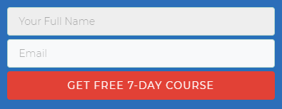
Take PPC Course’s sign up page — the button makes sure there’s no mistaking what happens when a reader clicks.
What Are Your Buttons Telling Readers?
As you can see, getting call to action copy spot on isn’t a matter of just throwing 3 or 4 words together. When you need to craft button or link copy that gets more people clicking, remember these techniques:
- Put readers in the middle of the action
- Convey the consequences of the click
- Harness the power of “start”
- Be specific
- Highlight the value of an action
Do you have a favorite “go to” method when writing call to actions? Let us know in the comments!
AUTHOR BIO
Dean Mackenzie is a copywriter helping businesses do more with their copy, especially around sales and landing pages, emails and funnels. He also enjoys a good cup of tea and speaking about himself in the third person.

